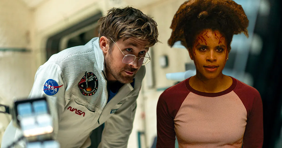
My god, I’m seeing double.
Welcome to The Queue — your daily distraction of curated video content sourced from across the web. Today, we’re watching a video essay that explores the narrative and thematic power of the split-screen in 1973’s ‘Wicked Wicked.’
It can be tempting to dismiss certain cinematographic flourishes as nothing but style for style’s sake. And while potentially substance-less style can rub you the wrong way depending on where your allegiances lie, it’s diplomatic to assume prima facie that what you’re seeing on screen exists for one purpose or another. Then you don’t get caught with your visual analysis pants down if it turns out the powers that be weren’t just showing off.
To give a concrete example: let’s talk about the split-screen and its more-divided cousin, the multi-image screen image. While most folks are familiar with split screens thanks to the work of Brian DePalma, the idea of fracturing the frame into two (or more) images has been around (at least) since the likes of Lois Weber’s 1917 film Suspense. The possibilities expanded with the advent of wider aspect ratios, like CinemaScope.
While most directors used this increased real estate to adopt a more painterly approach, others like Wicked, Wicked director Richard L. Bare decided to use the extra elbow room to present as much simultaneous action as possible.
While the 1973 MGM film has been (to be fair, correctly) relegated to a historical curio, the curiosity in question is more than worth a modern peek. Unlike other films, which might employ a split screen here and there for dramatic impact, the entirety of Wicked, Wicked takes place in split-screen. Wild? Yes. But don’t take it from me, and go see double for yourself:
Watch “Simultaneous Tensions: The Duo-Vision of Wicked, Wicked”
Who made this?
This video essay on the use of the split-screen and the multiple-screen image of the 1973 thriller Wicked, Wicked is by Toronto-based filmmaker and preservationist Stephen Broomer. You can find Broomer’s work on Vimeo at the delightfully Pauline Kael inspired named Art & Trash. They also have a website under the same name, which I highly recommend perusing. You can also find them on Twitter here.
More videos like this
- For another sample of Stephen Broomer’s work, here’s their video essay on the work of little-known home video director Michael Krueger.
- And another, on how 1987’s Beyond the Seventh Door functions as a folk-like parable.
- And one more from Broomer on how Andrew Getty’s The Evil Within reflects the tortured mindset of its creator.
- While he didn’t invent the idea, Brain De Palma is absolutely the most well-known director associated with the split-screen frame. Here’s a video essay from The Discarded Image on the self-aware horror of De Palma’s New Hollywood classic, Carrie.
Related Topics: Cinematography, The Queue

Recommended Reading


